
About Me
I’m SISSOKO Moussa
, a data analyst specializing in Power BI and SQL. I turn complex data into clear insights to help businesses make informed decisions. Explore my projects in this portfolio.
Skills

Excel | Tableau | Power Bi | Sas | Python | R studio
Project Spotlight
Power Bi
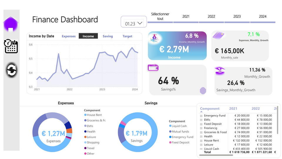
Finance Dashboard
Creating a financial dashboard to track key financial indicators is essential for both businesses and individuals. With the use of DAX (Data Analysis Expressions) in Power BI or Excel, you can create an efficient and dynamic dashboard to help with budgeting and financial planning.
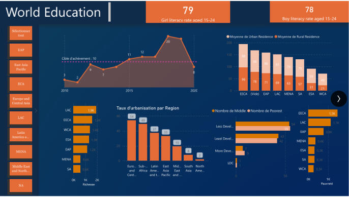
World Education Insights
Understanding the Economic Impact of Education in Africa: A Data-Driven PerspectiveI'm excited to share my very first Power BI project! As a newcomer to Power BI, I embarked on creating a dashboard to analyze the share of public spending (GDP) on education in Africa, as well as education levels across the continent.Education in Africa is a cause close to my heart, and I wanted to explore how data could help uncover both the opportunities and gaps in the region's educational landscape. My goal was to create a simple yet informative dashboard to visualize some key trends.I'm pleased to share this initial project, which, although simple, has helped me appreciate Power BI's potential for analyzing real-world data. I aim to continue learning and developing more sophisticated projects to contribute positively to areas I care deeply about.

School Completion
School completion rates worldwide are on the rise, indicating significant progress in access to education. However, this positive trend hides a concerning reality: an increasing number of young people are dropping out before finishing their studies. These dropouts present major challenges, particularly in terms of economic and social development, highlighting the need for targeted solutions to support at-risk students.
Professional Certifications
Statistics with R | Delivred by University Paris Saclay

Advanced Excel

Data analysis with Python